HealthTap
Virtual primary care
HealthTap is a virtual care platform which connect doctors with patients via on-demand/by appointment video, audio, or text-chat and by asynchronous message.
Company: HealthTap
My role: Product Designer
Duration: Aug 2018 - Sep 2019
Tools used: Sketch, InVision, Zeplin, JIRA, Adobe Creative Suite
Background
I joined HealthTap on August 2018, working on a variety of projects including: the redesign of “Post a question” for the HealthTap consumer product, redesign of schedule setup calendar for HealthTap provider app, and the enterprise product Bupa Hong Kong.
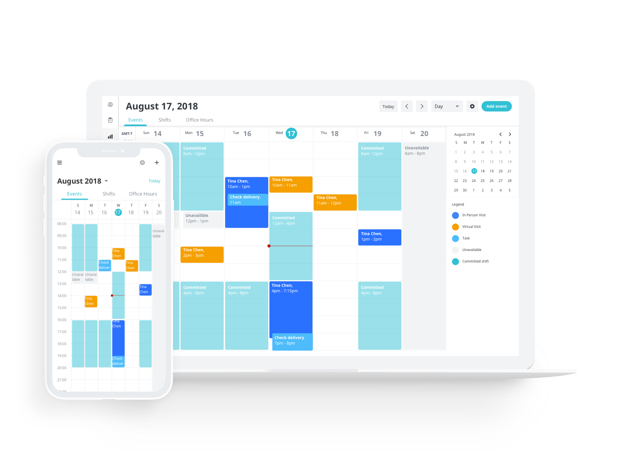
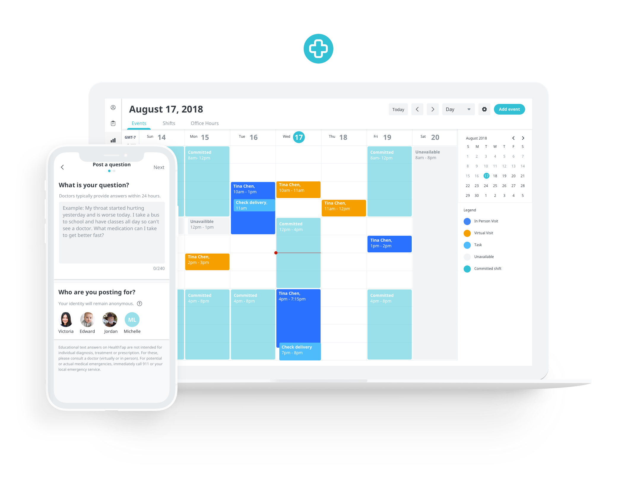
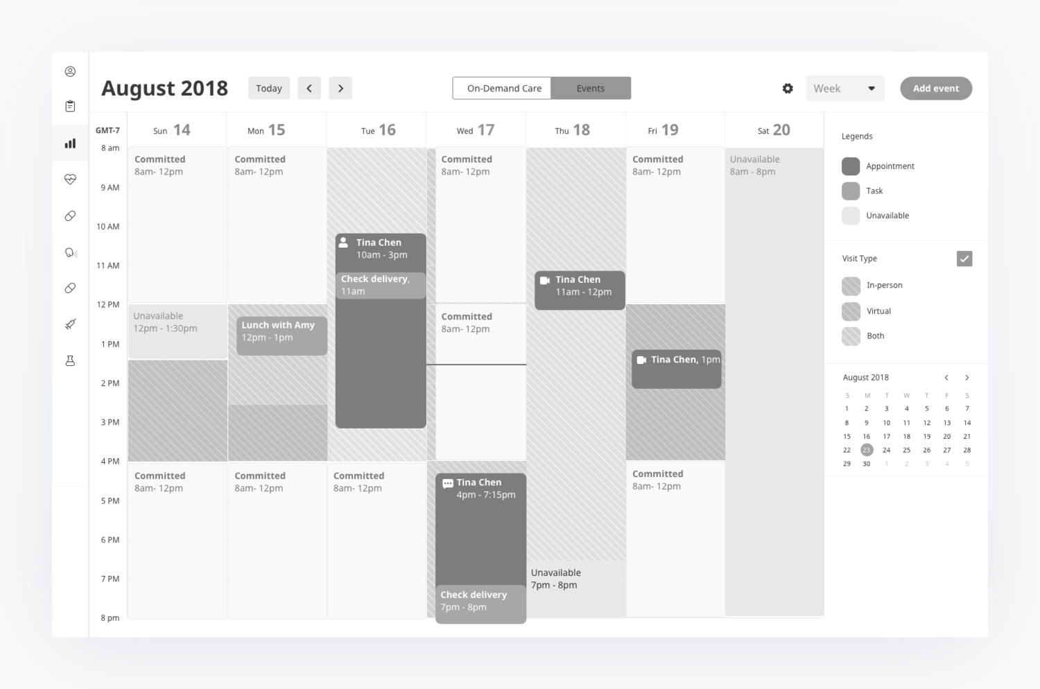
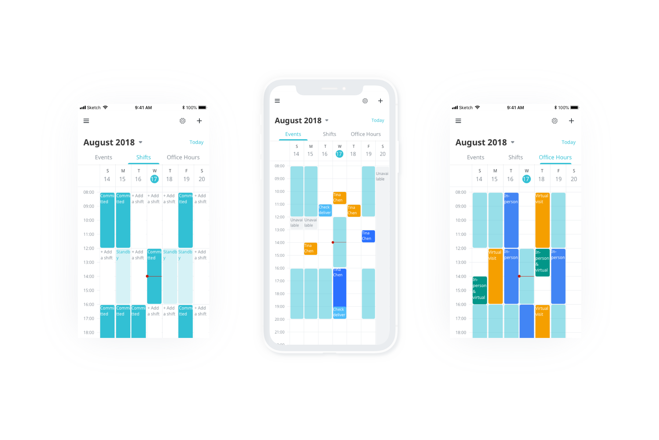
Case study 1: Redesign provider Schedule Setup & Calendar
Background
HealthTap built out Events, Shifts, and Office hours calendars over the years as the company evolved. The three calendars sat in completely different places, which caused inconvenience for doctors to check their schedule. In all, the calendars were outdated and didn’t work as they were intended to. Data showed doctors spent a large amount of time switching back and forth between calendars in order to figure out time available while scheduling with patients. It caused frustration for doctors, and decreased user satisfaction. This was the main reason why the calendars needed to be redesigned.
Problem
There wasn’t a direct view of time unavailable (Committed shifts) in the ‘Events’ calendar which prevented doctors from managing their schedule efficiently
In the Office hours calendar, visit hours and time off were separated from each other
The color code of visit types were also not visually clear
In the Shifts calendar, calendar view worked as a template
No universal region and time zone was setup in the three calendars
Goal
To design a unified calendar where doctors can view/edit their schedule, office hours and shifts easily
To enable doctors to switch between 3 calendars seamlessly
Update to a modern UI using current design style guide
Features
Ability to create, update, delete an Event/Office hours/Shifts
View Event/Office hours/Shifts details
Switch between different calendars (Events, Office hours, Shifts) seamlessly
Create, edit, delete events and tasks on the calendar with a view of committed shifts
Switch between day and week view
Set and save timezone
Switch and save region

Previous Calendar View

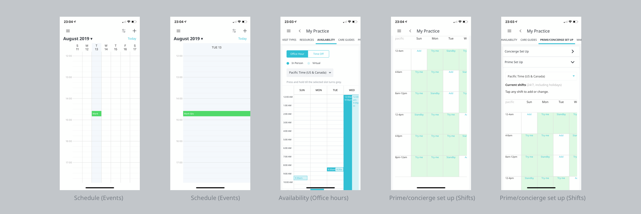
Explorations
Events/Tasks

Set up a task on my calendar
Edit/delete a task on my calendar
Visually see if my task has a conflict with my appointment/shift schedule
Set up an event on my calendar
If an event created has a conflict with my shift schedule (if applicable), I should be shown an error message
Edit/delete an event on my calendar
Shifts (Prime/concierge set up)
Setup weekly shift schedule (includes Committed. vs Standby Shifts). Default is 4 hours shifts
Easily cancel/delete weekly shift schedule (includes Committed vs. Standby Shifts)
Set and save timezone and view schedule accordingly
Add the vacation days/holidays (setting unavailable time)
View vacation days/holidays on schedule

Office hours (availability)
Set my virtual visit hours and my in-person availability as a weekly schedule for my patients
Preview my Visit Hours without leaving the Availability Page
Set and save my timezone
Edit in-person availability, virtual visit availability (15-min or 30-min increment changes depending on provider’s availability)
Delete my in-person availability, virtual visit availability
Add both my in-person/virtual visit availability at the same time
Availability updates are reflected on my/member view of Virtual Practice Page correctly


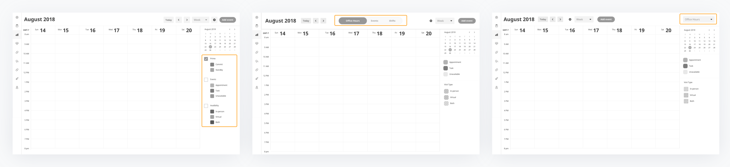
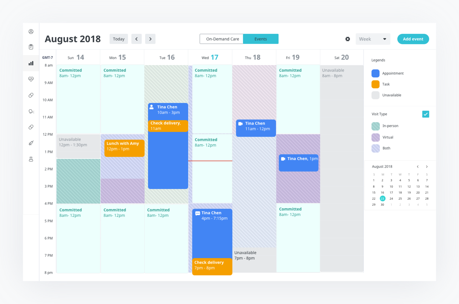
New Calendar Outline


With the help of our visual designer Eugene Tonev, who is responsible for our visual style guide across all platforms, we landed on a brand new color palette.


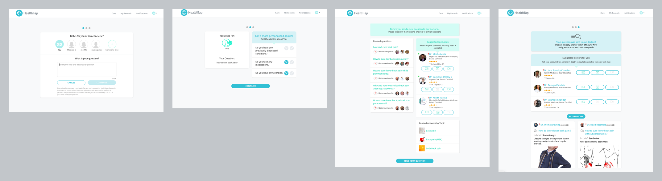
Case study 2: Redesign Post a question
Goal
Simplify the flow
Bring old code to new code base
Update to a modern UI using current design style guide
Change the flow order to serve related Q&A before post questions
Remove Guest as a user type
Remove ‘Add a new profile’ for personalization
Add location as required information for personalization
Make gender and DOB as required information for personalization
Remove Dr A.I. hand-off
Problem
HealthTap houses the largest Knowledge-Base of curated medical content from the participation of >144,000 doctors (in 163 specialties) insights on questions, topics, conditions, trending news, checklists, etc. 7 billion answers have been served. Post a question, one of the most used and valuable features HealthTap offers was old and out-dated, and in need of improvement.
The previous production was also part of an outdated code base and did not have a well-thought out web experience for users.
Design process

Before start working on particular screens I rethought the entire post a question flow. I created a flow chart considering high-level architecture with the board team.
I also conducted 12 in-person user interviews to find out the following:
Time users spend on completing the flow
User behavior while navigating the flow
Data that helps users to filter out the relevance of content in the Related Q&A list
Account display vs filling in the form for personalization
Whether to include other care options in the flow
Data showed that HealthTap had a good amount of similar questions which already have great answers. To reduce HealthTap doctor's repetitive labor and enrich the question and answer library, we wanted our users to check out related questions & answers before posting their questions.


User Testing Results

Related Q&A Summary View
The information/data that helps users to find the most relevant contents.
Title of the question
Number of doctor agrees and answers
Date when the question is posted
Doctor answer summary (2/4 users would glance through)
Images (2/4 users believe images help filtering out irrelevant content)
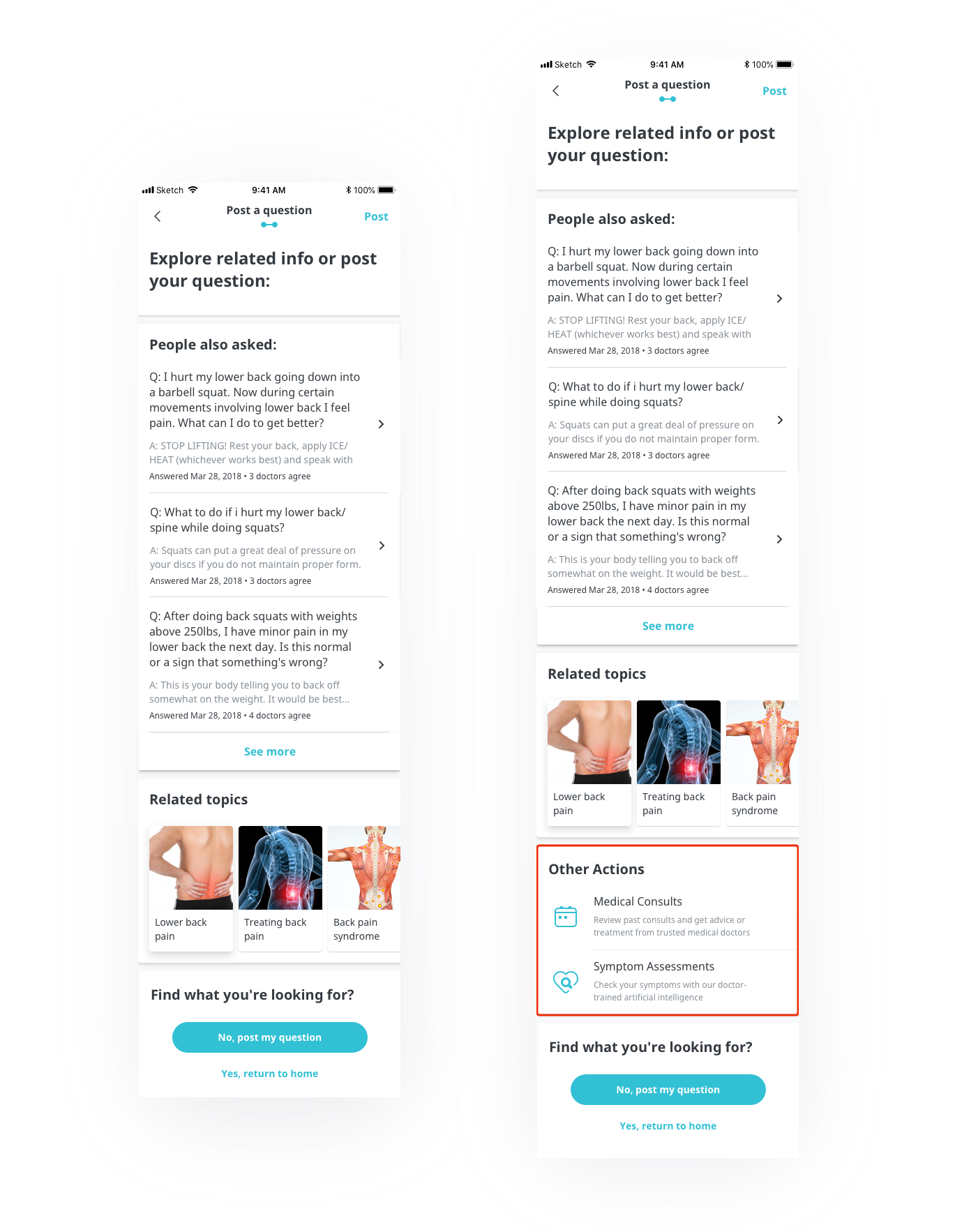
Whether to include ‘Other actions’ module
Pros
Direct users to get help through whatever ways
Easy to switch to different care options during the flow
Cons
Page being too long to browse through
Interrupt the flow and prevent user from finding answers/posting question
Lose every detail user provided once leaving the current flow
Other points
Have ‘other methods’ shown in a prompt at the end of the flow
Prompt a modal informing user about exiting the current flow
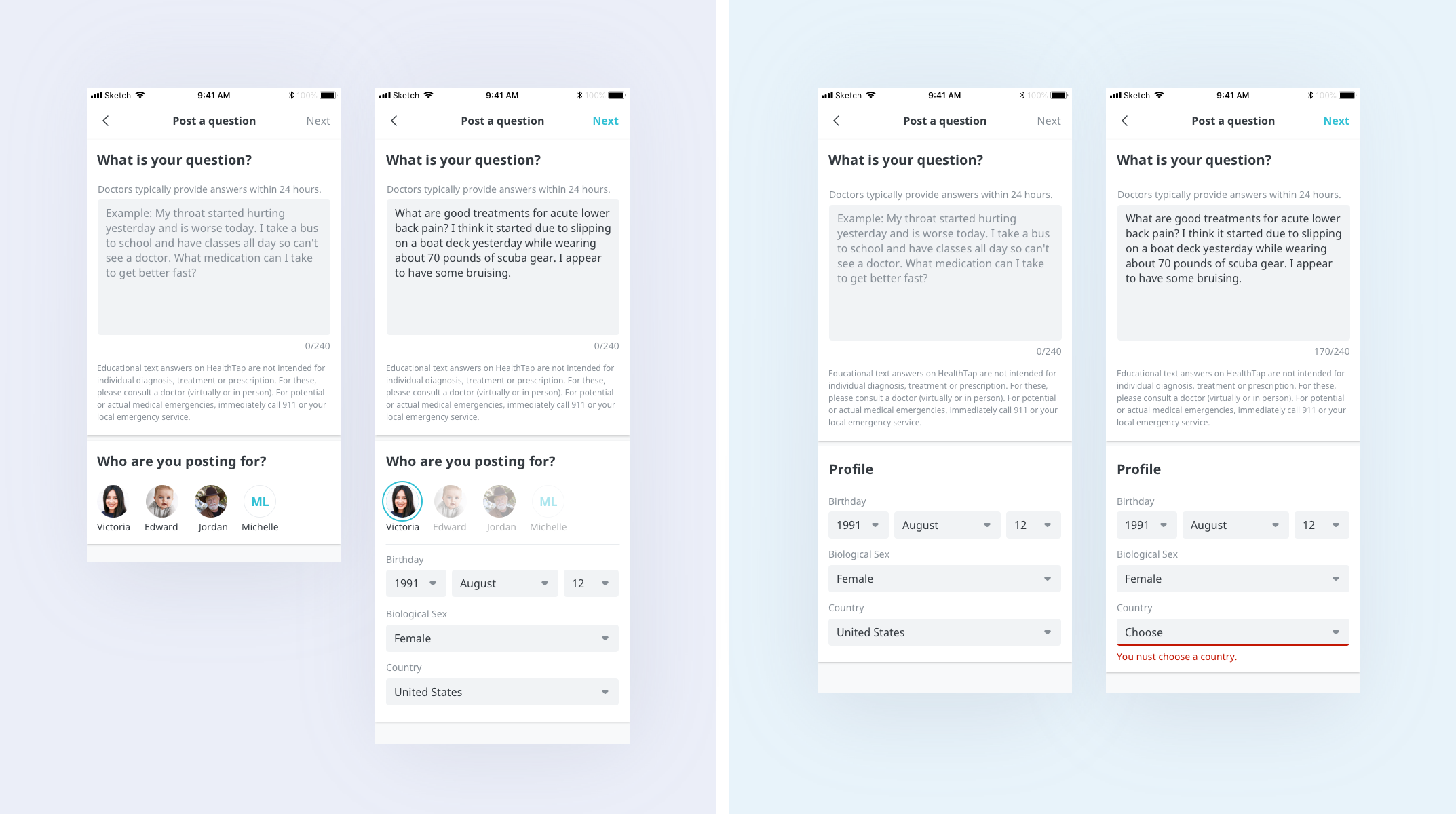
Account display vs. Filling form
Users prefer to have account display for the following reasons:
Easy to switch between accounts
Require to click once to select an account
Comfortable sharing private information in a secure environment


